mirror of
https://github.com/facebook/react-native.git
synced 2025-11-01 09:14:26 +00:00
 Eli White
e9b4928311
Eli White
e9b4928311
Summary: I wrote up a bunch of context for this in response to #27038 by fat. That comment is reproduced here in this commit message. You can see it in it's original contxt here: https://github.com/facebook/react-native/pull/27038 Okay, here is what I think is happening. For context, here is a diagram I have of how focus and blur propagates through the system. This might be interesting to refer back to as you go through the rest of my explanation. 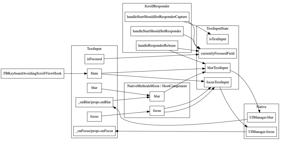 ScrollView's scrollResponder is responsible for blurring text inputs when a touch occurs in the ScrollView but outside of the currently focused TextInput. The code for that is here: https://github.com/facebook/react-native/blob/6ba2769f0f92ca75fb0eb60ccb8337920a9c31eb/Libraries/Components/ScrollResponder.js#L301-L314 This happens on `scrollResponderHandleResponderRelease` aka, touch up. It checks for what the currently focused textinput is by calling `TextInputState.currentlyFocusedField()`. That function is a JS variable that is being updated by calls to `TextInputState.focusTextInput` and `TextInputState.blurTextInput`: https://github.com/facebook/react-native/blob/6ba2769f0f92ca75fb0eb60ccb8337920a9c31eb/Libraries/Components/TextInput/TextInputState.js#L36-L71 I added some console logs to those methods to see which ones are being called when running your repro (thanks for the repro!). **This is without your fix** Click on and off: ``` // Click on input 1 focusTextInput input1 TextInput's _onFocus called // Click on blank space scrollResponderHandleResponderRelease blur input1 blurTextInput input1 TextInput's _onBlur called ``` Click on input1, then input 2, then off ``` // Click on input 1 focusTextInput input1 TextInput's _onFocus called for input1 // Click on input 2 focusTextInput input2 TextInput's _onBlur called for input1 TextInput's _onFocus called for input2 // Click on blank space scrollResponderHandleResponderRelease blur input2 blurTextInput input2 TextInput's _onBlur called for input2 ``` And now for the bug. Click on input 1, tab to 2, then off ``` // Click on input 1 focusTextInput input1 TextInput's _onFocus called for input1 // Tab to input 2 TextInput's _onBlur called for input1 TextInput's _onFocus called for input2 // Click on blank space scrollResponderHandleResponderRelease blur input1 blurTextInput input1 ``` Notice how `focusTextInput` was never called with input2 in the last example. Since this is the function that sets the `currentlyFocusedField` when we click on the blank space RN is trying to blur the first input instead of the second. # The root cause We are tracking the state of which field is focused in JS which has to stay in sync with what native knows is focused. We [listen to _onPress](https://github.com/facebook/react-native/blob/6ba2769f0f92ca75fb0eb60ccb8337920a9c31eb/Libraries/Components/TextInput/TextInput.js#L1103-L1107) and call `TextInputState.focusTextInput` in that handler. However, we don't currently have anything listening to other ways for an input to become focused (like tabbing) so it doesn't end up updating the `currentlyFocusedField`. We have the same problem with blur that we actually fixed the same way you did here in this PR: https://github.com/facebook/react-native/blob/6ba2769f0f92ca75fb0eb60ccb8337920a9c31eb/Libraries/Components/TextInput/TextInput.js#L1182-L1189 If you look back at my diagram at the beginning of this post, you'll notice the missing edge from `TextInput._onFocus` to `TextInputState.focusTextInput`. That's the problem. :) The reason this solution works is because this function **is** the notification from native that an input was focused or blurred. This solution is *fine* because this updates the `currentlyFocusedID` but isn't great because it both sets that value and **calls the native code to focus or blur again**. Luckily the native code doesn't send an event back to JS if you try to blur an already blurred TextInput otherwise we'd have an infinite loop. # The correct solution The correct thing would probably be to have all of this tracking in native code and not in JavaScript code. That's a pretty big change though and very out of scope. Something for our team to keep in mind for the future. A short term term solution would be to refactor `focusTextInput` and `blurTextInput` to pull out the part that sets the `currentlyFocusedID` that we could call from `TextInput` directly from `_onFocus` and `_onBlur`. # ^This short term term solution is what this commit is doing. Changelog: [General][Changed] TextInput no longer does an extra round trip to native on focus/blur Reviewed By: RSNara Differential Revision: D18278359 fbshipit-source-id: 417566f25075a847b0f4bac2888f92fbac934096
1118 lines
30 KiB
JavaScript
1118 lines
30 KiB
JavaScript
/**
|
|
* Copyright (c) Facebook, Inc. and its affiliates.
|
|
*
|
|
* This source code is licensed under the MIT license found in the
|
|
* LICENSE file in the root directory of this source tree.
|
|
*
|
|
* @flow
|
|
* @format
|
|
*/
|
|
|
|
'use strict';
|
|
|
|
const DeprecatedTextInputPropTypes = require('../../DeprecatedPropTypes/DeprecatedTextInputPropTypes');
|
|
const NativeMethodsMixin = require('../../Renderer/shims/NativeMethodsMixin');
|
|
const Platform = require('../../Utilities/Platform');
|
|
const React = require('react');
|
|
const ReactNative = require('../../Renderer/shims/ReactNative');
|
|
const StyleSheet = require('../../StyleSheet/StyleSheet');
|
|
const Text = require('../../Text/Text');
|
|
const TextAncestor = require('../../Text/TextAncestor');
|
|
const TextInputState = require('./TextInputState');
|
|
const TouchableWithoutFeedback = require('../Touchable/TouchableWithoutFeedback');
|
|
|
|
const createReactClass = require('create-react-class');
|
|
const invariant = require('invariant');
|
|
const requireNativeComponent = require('../../ReactNative/requireNativeComponent');
|
|
|
|
import type {TextStyleProp, ViewStyleProp} from '../../StyleSheet/StyleSheet';
|
|
import type {ColorValue} from '../../StyleSheet/StyleSheetTypes';
|
|
import type {ViewProps} from '../View/ViewPropTypes';
|
|
import type {SyntheticEvent, ScrollEvent} from '../../Types/CoreEventTypes';
|
|
import type {PressEvent} from '../../Types/CoreEventTypes';
|
|
import type {HostComponent} from '../../Renderer/shims/ReactNativeTypes';
|
|
|
|
let AndroidTextInput;
|
|
let RCTMultilineTextInputView;
|
|
let RCTSinglelineTextInputView;
|
|
|
|
if (Platform.OS === 'android') {
|
|
AndroidTextInput = require('./AndroidTextInputNativeComponent').default;
|
|
} else if (Platform.OS === 'ios') {
|
|
RCTMultilineTextInputView = requireNativeComponent(
|
|
'RCTMultilineTextInputView',
|
|
);
|
|
RCTSinglelineTextInputView = requireNativeComponent(
|
|
'RCTSinglelineTextInputView',
|
|
);
|
|
}
|
|
|
|
export type ChangeEvent = SyntheticEvent<
|
|
$ReadOnly<{|
|
|
eventCount: number,
|
|
target: number,
|
|
text: string,
|
|
|}>,
|
|
>;
|
|
|
|
export type TextInputEvent = SyntheticEvent<
|
|
$ReadOnly<{|
|
|
eventCount: number,
|
|
previousText: string,
|
|
range: $ReadOnly<{|
|
|
start: number,
|
|
end: number,
|
|
|}>,
|
|
target: number,
|
|
text: string,
|
|
|}>,
|
|
>;
|
|
|
|
export type ContentSizeChangeEvent = SyntheticEvent<
|
|
$ReadOnly<{|
|
|
target: number,
|
|
contentSize: $ReadOnly<{|
|
|
width: number,
|
|
height: number,
|
|
|}>,
|
|
|}>,
|
|
>;
|
|
|
|
type TargetEvent = SyntheticEvent<
|
|
$ReadOnly<{|
|
|
target: number,
|
|
|}>,
|
|
>;
|
|
|
|
export type BlurEvent = TargetEvent;
|
|
export type FocusEvent = TargetEvent;
|
|
|
|
type Selection = $ReadOnly<{|
|
|
start: number,
|
|
end: number,
|
|
|}>;
|
|
|
|
export type SelectionChangeEvent = SyntheticEvent<
|
|
$ReadOnly<{|
|
|
selection: Selection,
|
|
target: number,
|
|
|}>,
|
|
>;
|
|
|
|
export type KeyPressEvent = SyntheticEvent<
|
|
$ReadOnly<{|
|
|
key: string,
|
|
target?: ?number,
|
|
eventCount?: ?number,
|
|
|}>,
|
|
>;
|
|
|
|
export type EditingEvent = SyntheticEvent<
|
|
$ReadOnly<{|
|
|
eventCount: number,
|
|
text: string,
|
|
target: number,
|
|
|}>,
|
|
>;
|
|
|
|
type DataDetectorTypesType =
|
|
| 'phoneNumber'
|
|
| 'link'
|
|
| 'address'
|
|
| 'calendarEvent'
|
|
| 'none'
|
|
| 'all';
|
|
|
|
export type KeyboardType =
|
|
// Cross Platform
|
|
| 'default'
|
|
| 'email-address'
|
|
| 'numeric'
|
|
| 'phone-pad'
|
|
| 'number-pad'
|
|
| 'decimal-pad'
|
|
// iOS-only
|
|
| 'ascii-capable'
|
|
| 'numbers-and-punctuation'
|
|
| 'url'
|
|
| 'name-phone-pad'
|
|
| 'twitter'
|
|
| 'web-search'
|
|
// iOS 10+ only
|
|
| 'ascii-capable-number-pad'
|
|
// Android-only
|
|
| 'visible-password';
|
|
|
|
export type ReturnKeyType =
|
|
// Cross Platform
|
|
| 'done'
|
|
| 'go'
|
|
| 'next'
|
|
| 'search'
|
|
| 'send'
|
|
// Android-only
|
|
| 'none'
|
|
| 'previous'
|
|
// iOS-only
|
|
| 'default'
|
|
| 'emergency-call'
|
|
| 'google'
|
|
| 'join'
|
|
| 'route'
|
|
| 'yahoo';
|
|
|
|
export type AutoCapitalize = 'none' | 'sentences' | 'words' | 'characters';
|
|
|
|
export type TextContentType =
|
|
| 'none'
|
|
| 'URL'
|
|
| 'addressCity'
|
|
| 'addressCityAndState'
|
|
| 'addressState'
|
|
| 'countryName'
|
|
| 'creditCardNumber'
|
|
| 'emailAddress'
|
|
| 'familyName'
|
|
| 'fullStreetAddress'
|
|
| 'givenName'
|
|
| 'jobTitle'
|
|
| 'location'
|
|
| 'middleName'
|
|
| 'name'
|
|
| 'namePrefix'
|
|
| 'nameSuffix'
|
|
| 'nickname'
|
|
| 'organizationName'
|
|
| 'postalCode'
|
|
| 'streetAddressLine1'
|
|
| 'streetAddressLine2'
|
|
| 'sublocality'
|
|
| 'telephoneNumber'
|
|
| 'username'
|
|
| 'password'
|
|
| 'newPassword'
|
|
| 'oneTimeCode';
|
|
|
|
type PasswordRules = string;
|
|
|
|
type IOSProps = $ReadOnly<{|
|
|
/**
|
|
* If `false`, disables spell-check style (i.e. red underlines).
|
|
* The default value is inherited from `autoCorrect`.
|
|
* @platform ios
|
|
*/
|
|
spellCheck?: ?boolean,
|
|
|
|
/**
|
|
* Determines the color of the keyboard.
|
|
* @platform ios
|
|
*/
|
|
keyboardAppearance?: ?('default' | 'light' | 'dark'),
|
|
|
|
/**
|
|
* If `true`, the keyboard disables the return key when there is no text and
|
|
* automatically enables it when there is text. The default value is `false`.
|
|
* @platform ios
|
|
*/
|
|
enablesReturnKeyAutomatically?: ?boolean,
|
|
|
|
/**
|
|
* When the clear button should appear on the right side of the text view.
|
|
* This property is supported only for single-line TextInput component.
|
|
* @platform ios
|
|
*/
|
|
clearButtonMode?: ?('never' | 'while-editing' | 'unless-editing' | 'always'),
|
|
|
|
/**
|
|
* If `true`, clears the text field automatically when editing begins.
|
|
* @platform ios
|
|
*/
|
|
clearTextOnFocus?: ?boolean,
|
|
|
|
/**
|
|
* Determines the types of data converted to clickable URLs in the text input.
|
|
* Only valid if `multiline={true}` and `editable={false}`.
|
|
* By default no data types are detected.
|
|
*
|
|
* You can provide one type or an array of many types.
|
|
*
|
|
* Possible values for `dataDetectorTypes` are:
|
|
*
|
|
* - `'phoneNumber'`
|
|
* - `'link'`
|
|
* - `'address'`
|
|
* - `'calendarEvent'`
|
|
* - `'none'`
|
|
* - `'all'`
|
|
*
|
|
* @platform ios
|
|
*/
|
|
dataDetectorTypes?:
|
|
| ?DataDetectorTypesType
|
|
| $ReadOnlyArray<DataDetectorTypesType>,
|
|
|
|
/**
|
|
* An optional identifier which links a custom InputAccessoryView to
|
|
* this text input. The InputAccessoryView is rendered above the
|
|
* keyboard when this text input is focused.
|
|
* @platform ios
|
|
*/
|
|
inputAccessoryViewID?: ?string,
|
|
|
|
/**
|
|
* Give the keyboard and the system information about the
|
|
* expected semantic meaning for the content that users enter.
|
|
* @platform ios
|
|
*/
|
|
textContentType?: ?TextContentType,
|
|
|
|
PasswordRules?: ?PasswordRules,
|
|
|
|
/**
|
|
* If `false`, scrolling of the text view will be disabled.
|
|
* The default value is `true`. Does only work with 'multiline={true}'.
|
|
* @platform ios
|
|
*/
|
|
scrollEnabled?: ?boolean,
|
|
|}>;
|
|
|
|
type AndroidProps = $ReadOnly<{|
|
|
/**
|
|
* Determines which content to suggest on auto complete, e.g.`username`.
|
|
* To disable auto complete, use `off`.
|
|
*
|
|
* *Android Only*
|
|
*
|
|
* The following values work on Android only:
|
|
*
|
|
* - `username`
|
|
* - `password`
|
|
* - `email`
|
|
* - `name`
|
|
* - `tel`
|
|
* - `street-address`
|
|
* - `postal-code`
|
|
* - `cc-number`
|
|
* - `cc-csc`
|
|
* - `cc-exp`
|
|
* - `cc-exp-month`
|
|
* - `cc-exp-year`
|
|
* - `off`
|
|
*
|
|
* @platform android
|
|
*/
|
|
autoCompleteType?: ?(
|
|
| 'cc-csc'
|
|
| 'cc-exp'
|
|
| 'cc-exp-month'
|
|
| 'cc-exp-year'
|
|
| 'cc-number'
|
|
| 'email'
|
|
| 'name'
|
|
| 'password'
|
|
| 'postal-code'
|
|
| 'street-address'
|
|
| 'tel'
|
|
| 'username'
|
|
| 'off'
|
|
),
|
|
|
|
/**
|
|
* Sets the return key to the label. Use it instead of `returnKeyType`.
|
|
* @platform android
|
|
*/
|
|
returnKeyLabel?: ?string,
|
|
|
|
/**
|
|
* Sets the number of lines for a `TextInput`. Use it with multiline set to
|
|
* `true` to be able to fill the lines.
|
|
* @platform android
|
|
*/
|
|
numberOfLines?: ?number,
|
|
|
|
/**
|
|
* When `false`, if there is a small amount of space available around a text input
|
|
* (e.g. landscape orientation on a phone), the OS may choose to have the user edit
|
|
* the text inside of a full screen text input mode. When `true`, this feature is
|
|
* disabled and users will always edit the text directly inside of the text input.
|
|
* Defaults to `false`.
|
|
* @platform android
|
|
*/
|
|
disableFullscreenUI?: ?boolean,
|
|
|
|
/**
|
|
* Set text break strategy on Android API Level 23+, possible values are `simple`, `highQuality`, `balanced`
|
|
* The default value is `simple`.
|
|
* @platform android
|
|
*/
|
|
textBreakStrategy?: ?('simple' | 'highQuality' | 'balanced'),
|
|
|
|
/**
|
|
* The color of the `TextInput` underline.
|
|
* @platform android
|
|
*/
|
|
underlineColorAndroid?: ?ColorValue,
|
|
|
|
/**
|
|
* If defined, the provided image resource will be rendered on the left.
|
|
* The image resource must be inside `/android/app/src/main/res/drawable` and referenced
|
|
* like
|
|
* ```
|
|
* <TextInput
|
|
* inlineImageLeft='search_icon'
|
|
* />
|
|
* ```
|
|
* @platform android
|
|
*/
|
|
inlineImageLeft?: ?string,
|
|
|
|
/**
|
|
* Padding between the inline image, if any, and the text input itself.
|
|
* @platform android
|
|
*/
|
|
inlineImagePadding?: ?number,
|
|
|
|
importantForAutofill?: ?(
|
|
| 'auto'
|
|
| 'no'
|
|
| 'noExcludeDescendants'
|
|
| 'yes'
|
|
| 'yesExcludeDescendants'
|
|
),
|
|
|
|
/**
|
|
* When `false`, it will prevent the soft keyboard from showing when the field is focused.
|
|
* Defaults to `true`.
|
|
* @platform android
|
|
*/
|
|
showSoftInputOnFocus?: ?boolean,
|
|
|}>;
|
|
|
|
export type Props = $ReadOnly<{|
|
|
...$Diff<ViewProps, $ReadOnly<{|style: ?ViewStyleProp|}>>,
|
|
...IOSProps,
|
|
...AndroidProps,
|
|
|
|
/**
|
|
* Can tell `TextInput` to automatically capitalize certain characters.
|
|
*
|
|
* - `characters`: all characters.
|
|
* - `words`: first letter of each word.
|
|
* - `sentences`: first letter of each sentence (*default*).
|
|
* - `none`: don't auto capitalize anything.
|
|
*/
|
|
autoCapitalize?: ?AutoCapitalize,
|
|
|
|
/**
|
|
* If `false`, disables auto-correct. The default value is `true`.
|
|
*/
|
|
autoCorrect?: ?boolean,
|
|
|
|
/**
|
|
* If `true`, focuses the input on `componentDidMount`.
|
|
* The default value is `false`.
|
|
*/
|
|
autoFocus?: ?boolean,
|
|
|
|
/**
|
|
* Specifies whether fonts should scale to respect Text Size accessibility settings. The
|
|
* default is `true`.
|
|
*/
|
|
allowFontScaling?: ?boolean,
|
|
|
|
/**
|
|
* Specifies largest possible scale a font can reach when `allowFontScaling` is enabled.
|
|
* Possible values:
|
|
* `null/undefined` (default): inherit from the parent node or the global default (0)
|
|
* `0`: no max, ignore parent/global default
|
|
* `>= 1`: sets the maxFontSizeMultiplier of this node to this value
|
|
*/
|
|
maxFontSizeMultiplier?: ?number,
|
|
|
|
/**
|
|
* If `false`, text is not editable. The default value is `true`.
|
|
*/
|
|
editable?: ?boolean,
|
|
|
|
/**
|
|
* Determines which keyboard to open, e.g.`numeric`.
|
|
*
|
|
* The following values work across platforms:
|
|
*
|
|
* - `default`
|
|
* - `numeric`
|
|
* - `number-pad`
|
|
* - `decimal-pad`
|
|
* - `email-address`
|
|
* - `phone-pad`
|
|
*
|
|
* *iOS Only*
|
|
*
|
|
* The following values work on iOS only:
|
|
*
|
|
* - `ascii-capable`
|
|
* - `numbers-and-punctuation`
|
|
* - `url`
|
|
* - `name-phone-pad`
|
|
* - `twitter`
|
|
* - `web-search`
|
|
*
|
|
* *Android Only*
|
|
*
|
|
* The following values work on Android only:
|
|
*
|
|
* - `visible-password`
|
|
*/
|
|
keyboardType?: ?KeyboardType,
|
|
|
|
/**
|
|
* Determines how the return key should look. On Android you can also use
|
|
* `returnKeyLabel`.
|
|
*
|
|
* *Cross platform*
|
|
*
|
|
* The following values work across platforms:
|
|
*
|
|
* - `done`
|
|
* - `go`
|
|
* - `next`
|
|
* - `search`
|
|
* - `send`
|
|
*
|
|
* *Android Only*
|
|
*
|
|
* The following values work on Android only:
|
|
*
|
|
* - `none`
|
|
* - `previous`
|
|
*
|
|
* *iOS Only*
|
|
*
|
|
* The following values work on iOS only:
|
|
*
|
|
* - `default`
|
|
* - `emergency-call`
|
|
* - `google`
|
|
* - `join`
|
|
* - `route`
|
|
* - `yahoo`
|
|
*/
|
|
returnKeyType?: ?ReturnKeyType,
|
|
|
|
/**
|
|
* Limits the maximum number of characters that can be entered. Use this
|
|
* instead of implementing the logic in JS to avoid flicker.
|
|
*/
|
|
maxLength?: ?number,
|
|
|
|
/**
|
|
* If `true`, the text input can be multiple lines.
|
|
* The default value is `false`.
|
|
*/
|
|
multiline?: ?boolean,
|
|
|
|
/**
|
|
* Callback that is called when the text input is blurred.
|
|
*/
|
|
onBlur?: ?(e: BlurEvent) => mixed,
|
|
|
|
/**
|
|
* Callback that is called when the text input is focused.
|
|
*/
|
|
onFocus?: ?(e: FocusEvent) => mixed,
|
|
|
|
/**
|
|
* Callback that is called when the text input's text changes.
|
|
*/
|
|
onChange?: ?(e: ChangeEvent) => mixed,
|
|
|
|
/**
|
|
* Callback that is called when the text input's text changes.
|
|
* Changed text is passed as an argument to the callback handler.
|
|
*/
|
|
onChangeText?: ?(text: string) => mixed,
|
|
|
|
/**
|
|
* Callback that is called when the text input's content size changes.
|
|
* This will be called with
|
|
* `{ nativeEvent: { contentSize: { width, height } } }`.
|
|
*
|
|
* Only called for multiline text inputs.
|
|
*/
|
|
onContentSizeChange?: ?(e: ContentSizeChangeEvent) => mixed,
|
|
|
|
onTextInput?: ?(e: TextInputEvent) => mixed,
|
|
|
|
/**
|
|
* Callback that is called when text input ends.
|
|
*/
|
|
onEndEditing?: ?(e: EditingEvent) => mixed,
|
|
|
|
/**
|
|
* Callback that is called when the text input selection is changed.
|
|
* This will be called with
|
|
* `{ nativeEvent: { selection: { start, end } } }`.
|
|
*/
|
|
onSelectionChange?: ?(e: SelectionChangeEvent) => mixed,
|
|
|
|
/**
|
|
* Callback that is called when the text input's submit button is pressed.
|
|
* Invalid if `multiline={true}` is specified.
|
|
*/
|
|
onSubmitEditing?: ?(e: EditingEvent) => mixed,
|
|
|
|
/**
|
|
* Callback that is called when a key is pressed.
|
|
* This will be called with `{ nativeEvent: { key: keyValue } }`
|
|
* where `keyValue` is `'Enter'` or `'Backspace'` for respective keys and
|
|
* the typed-in character otherwise including `' '` for space.
|
|
* Fires before `onChange` callbacks.
|
|
*/
|
|
onKeyPress?: ?(e: KeyPressEvent) => mixed,
|
|
|
|
/**
|
|
* Invoked on content scroll with `{ nativeEvent: { contentOffset: { x, y } } }`.
|
|
* May also contain other properties from ScrollEvent but on Android contentSize
|
|
* is not provided for performance reasons.
|
|
*/
|
|
onScroll?: ?(e: ScrollEvent) => mixed,
|
|
|
|
/**
|
|
* The string that will be rendered before text input has been entered.
|
|
*/
|
|
placeholder?: ?Stringish,
|
|
|
|
/**
|
|
* The text color of the placeholder string.
|
|
*/
|
|
placeholderTextColor?: ?ColorValue,
|
|
|
|
/**
|
|
* If `true`, the text input obscures the text entered so that sensitive text
|
|
* like passwords stay secure. The default value is `false`. Does not work with 'multiline={true}'.
|
|
*/
|
|
secureTextEntry?: ?boolean,
|
|
|
|
/**
|
|
* The highlight and cursor color of the text input.
|
|
*/
|
|
selectionColor?: ?ColorValue,
|
|
|
|
/**
|
|
* The start and end of the text input's selection. Set start and end to
|
|
* the same value to position the cursor.
|
|
*/
|
|
selection?: ?$ReadOnly<{|
|
|
start: number,
|
|
end?: ?number,
|
|
|}>,
|
|
|
|
/**
|
|
* The value to show for the text input. `TextInput` is a controlled
|
|
* component, which means the native value will be forced to match this
|
|
* value prop if provided. For most uses, this works great, but in some
|
|
* cases this may cause flickering - one common cause is preventing edits
|
|
* by keeping value the same. In addition to simply setting the same value,
|
|
* either set `editable={false}`, or set/update `maxLength` to prevent
|
|
* unwanted edits without flicker.
|
|
*/
|
|
value?: ?Stringish,
|
|
|
|
/**
|
|
* Provides an initial value that will change when the user starts typing.
|
|
* Useful for simple use-cases where you do not want to deal with listening
|
|
* to events and updating the value prop to keep the controlled state in sync.
|
|
*/
|
|
defaultValue?: ?Stringish,
|
|
|
|
/**
|
|
* If `true`, all text will automatically be selected on focus.
|
|
*/
|
|
selectTextOnFocus?: ?boolean,
|
|
|
|
/**
|
|
* If `true`, the text field will blur when submitted.
|
|
* The default value is true for single-line fields and false for
|
|
* multiline fields. Note that for multiline fields, setting `blurOnSubmit`
|
|
* to `true` means that pressing return will blur the field and trigger the
|
|
* `onSubmitEditing` event instead of inserting a newline into the field.
|
|
*/
|
|
blurOnSubmit?: ?boolean,
|
|
|
|
/**
|
|
* Note that not all Text styles are supported, an incomplete list of what is not supported includes:
|
|
*
|
|
* - `borderLeftWidth`
|
|
* - `borderTopWidth`
|
|
* - `borderRightWidth`
|
|
* - `borderBottomWidth`
|
|
* - `borderTopLeftRadius`
|
|
* - `borderTopRightRadius`
|
|
* - `borderBottomRightRadius`
|
|
* - `borderBottomLeftRadius`
|
|
*
|
|
* see [Issue#7070](https://github.com/facebook/react-native/issues/7070)
|
|
* for more detail.
|
|
*
|
|
* [Styles](docs/style.html)
|
|
*/
|
|
style?: ?TextStyleProp,
|
|
|
|
/**
|
|
* If `true`, caret is hidden. The default value is `false`.
|
|
* This property is supported only for single-line TextInput component on iOS.
|
|
*/
|
|
caretHidden?: ?boolean,
|
|
|
|
/*
|
|
* If `true`, contextMenuHidden is hidden. The default value is `false`.
|
|
*/
|
|
contextMenuHidden?: ?boolean,
|
|
|}>;
|
|
|
|
const emptyFunctionThatReturnsTrue = () => true;
|
|
|
|
/**
|
|
* A foundational component for inputting text into the app via a
|
|
* keyboard. Props provide configurability for several features, such as
|
|
* auto-correction, auto-capitalization, placeholder text, and different keyboard
|
|
* types, such as a numeric keypad.
|
|
*
|
|
* The simplest use case is to plop down a `TextInput` and subscribe to the
|
|
* `onChangeText` events to read the user input. There are also other events,
|
|
* such as `onSubmitEditing` and `onFocus` that can be subscribed to. A simple
|
|
* example:
|
|
*
|
|
* ```ReactNativeWebPlayer
|
|
* import React, { Component } from 'react';
|
|
* import { AppRegistry, TextInput } from 'react-native';
|
|
*
|
|
* export default class UselessTextInput extends Component {
|
|
* constructor(props) {
|
|
* super(props);
|
|
* this.state = { text: 'Useless Placeholder' };
|
|
* }
|
|
*
|
|
* render() {
|
|
* return (
|
|
* <TextInput
|
|
* style={{height: 40, borderColor: 'gray', borderWidth: 1}}
|
|
* onChangeText={(text) => this.setState({text})}
|
|
* value={this.state.text}
|
|
* />
|
|
* );
|
|
* }
|
|
* }
|
|
*
|
|
* // skip this line if using Create React Native App
|
|
* AppRegistry.registerComponent('AwesomeProject', () => UselessTextInput);
|
|
* ```
|
|
*
|
|
* Two methods exposed via the native element are .focus() and .blur() that
|
|
* will focus or blur the TextInput programmatically.
|
|
*
|
|
* Note that some props are only available with `multiline={true/false}`.
|
|
* Additionally, border styles that apply to only one side of the element
|
|
* (e.g., `borderBottomColor`, `borderLeftWidth`, etc.) will not be applied if
|
|
* `multiline=false`. To achieve the same effect, you can wrap your `TextInput`
|
|
* in a `View`:
|
|
*
|
|
* ```ReactNativeWebPlayer
|
|
* import React, { Component } from 'react';
|
|
* import { AppRegistry, View, TextInput } from 'react-native';
|
|
*
|
|
* class UselessTextInput extends Component {
|
|
* render() {
|
|
* return (
|
|
* <TextInput
|
|
* {...this.props} // Inherit any props passed to it; e.g., multiline, numberOfLines below
|
|
* editable = {true}
|
|
* maxLength = {40}
|
|
* />
|
|
* );
|
|
* }
|
|
* }
|
|
*
|
|
* export default class UselessTextInputMultiline extends Component {
|
|
* constructor(props) {
|
|
* super(props);
|
|
* this.state = {
|
|
* text: 'Useless Multiline Placeholder',
|
|
* };
|
|
* }
|
|
*
|
|
* // If you type something in the text box that is a color, the background will change to that
|
|
* // color.
|
|
* render() {
|
|
* return (
|
|
* <View style={{
|
|
* backgroundColor: this.state.text,
|
|
* borderBottomColor: '#000000',
|
|
* borderBottomWidth: 1 }}
|
|
* >
|
|
* <UselessTextInput
|
|
* multiline = {true}
|
|
* numberOfLines = {4}
|
|
* onChangeText={(text) => this.setState({text})}
|
|
* value={this.state.text}
|
|
* />
|
|
* </View>
|
|
* );
|
|
* }
|
|
* }
|
|
*
|
|
* // skip these lines if using Create React Native App
|
|
* AppRegistry.registerComponent(
|
|
* 'AwesomeProject',
|
|
* () => UselessTextInputMultiline
|
|
* );
|
|
* ```
|
|
*
|
|
* `TextInput` has by default a border at the bottom of its view. This border
|
|
* has its padding set by the background image provided by the system, and it
|
|
* cannot be changed. Solutions to avoid this is to either not set height
|
|
* explicitly, case in which the system will take care of displaying the border
|
|
* in the correct position, or to not display the border by setting
|
|
* `underlineColorAndroid` to transparent.
|
|
*
|
|
* Note that on Android performing text selection in input can change
|
|
* app's activity `windowSoftInputMode` param to `adjustResize`.
|
|
* This may cause issues with components that have position: 'absolute'
|
|
* while keyboard is active. To avoid this behavior either specify `windowSoftInputMode`
|
|
* in AndroidManifest.xml ( https://developer.android.com/guide/topics/manifest/activity-element.html )
|
|
* or control this param programmatically with native code.
|
|
*
|
|
*/
|
|
|
|
const TextInput = createReactClass({
|
|
displayName: 'TextInput',
|
|
statics: {
|
|
State: {
|
|
currentlyFocusedField: TextInputState.currentlyFocusedField,
|
|
focusTextInput: TextInputState.focusTextInput,
|
|
blurTextInput: TextInputState.blurTextInput,
|
|
},
|
|
},
|
|
propTypes: DeprecatedTextInputPropTypes,
|
|
getDefaultProps() {
|
|
return {
|
|
allowFontScaling: true,
|
|
rejectResponderTermination: true,
|
|
underlineColorAndroid: 'transparent',
|
|
};
|
|
},
|
|
/**
|
|
* `NativeMethodsMixin` will look for this when invoking `setNativeProps`. We
|
|
* make `this` look like an actual native component class.
|
|
*/
|
|
mixins: [NativeMethodsMixin],
|
|
|
|
/**
|
|
* Returns `true` if the input is currently focused; `false` otherwise.
|
|
*/
|
|
isFocused: function(): boolean {
|
|
return (
|
|
TextInputState.currentlyFocusedField() ===
|
|
ReactNative.findNodeHandle(this._inputRef)
|
|
);
|
|
},
|
|
|
|
_inputRef: (undefined: any),
|
|
_focusSubscription: (undefined: ?Function),
|
|
_lastNativeText: (undefined: ?string),
|
|
_lastNativeSelection: (undefined: ?Selection),
|
|
_rafId: (null: ?AnimationFrameID),
|
|
|
|
componentDidMount: function() {
|
|
this._lastNativeText = this.props.value;
|
|
const tag = ReactNative.findNodeHandle(this._inputRef);
|
|
if (tag != null) {
|
|
// tag is null only in unit tests
|
|
TextInputState.registerInput(tag);
|
|
}
|
|
|
|
if (this.props.autoFocus) {
|
|
this._rafId = requestAnimationFrame(this.focus);
|
|
}
|
|
},
|
|
|
|
componentWillUnmount: function() {
|
|
this._focusSubscription && this._focusSubscription.remove();
|
|
if (this.isFocused()) {
|
|
this.blur();
|
|
}
|
|
const tag = ReactNative.findNodeHandle(this._inputRef);
|
|
if (tag != null) {
|
|
TextInputState.unregisterInput(tag);
|
|
}
|
|
if (this._rafId != null) {
|
|
cancelAnimationFrame(this._rafId);
|
|
}
|
|
},
|
|
|
|
/**
|
|
* Removes all text from the `TextInput`.
|
|
*/
|
|
clear: function() {
|
|
this.setNativeProps({text: ''});
|
|
},
|
|
|
|
render: function() {
|
|
let textInput;
|
|
if (Platform.OS === 'ios') {
|
|
textInput = this._renderIOS();
|
|
} else if (Platform.OS === 'android') {
|
|
textInput = this._renderAndroid();
|
|
}
|
|
return (
|
|
<TextAncestor.Provider value={true}>{textInput}</TextAncestor.Provider>
|
|
);
|
|
},
|
|
|
|
_getText: function(): ?string {
|
|
return typeof this.props.value === 'string'
|
|
? this.props.value
|
|
: typeof this.props.defaultValue === 'string'
|
|
? this.props.defaultValue
|
|
: '';
|
|
},
|
|
|
|
_setNativeRef: function(ref: any) {
|
|
this._inputRef = ref;
|
|
},
|
|
|
|
getNativeRef: function(): ?React.ElementRef<HostComponent<mixed>> {
|
|
return this._inputRef;
|
|
},
|
|
|
|
_renderIOS: function() {
|
|
const props = Object.assign({}, this.props);
|
|
props.style = [this.props.style];
|
|
|
|
if (props.selection && props.selection.end == null) {
|
|
props.selection = {
|
|
start: props.selection.start,
|
|
end: props.selection.start,
|
|
};
|
|
}
|
|
|
|
const RCTTextInputView = props.multiline
|
|
? RCTMultilineTextInputView
|
|
: RCTSinglelineTextInputView;
|
|
|
|
if (props.multiline) {
|
|
props.style.unshift(styles.multilineInput);
|
|
}
|
|
|
|
const textContainer = (
|
|
<RCTTextInputView
|
|
ref={this._setNativeRef}
|
|
{...props}
|
|
onFocus={this._onFocus}
|
|
onBlur={this._onBlur}
|
|
onChange={this._onChange}
|
|
onContentSizeChange={this.props.onContentSizeChange}
|
|
onSelectionChange={this._onSelectionChange}
|
|
onTextInput={this._onTextInput}
|
|
onSelectionChangeShouldSetResponder={emptyFunctionThatReturnsTrue}
|
|
text={this._getText()}
|
|
dataDetectorTypes={this.props.dataDetectorTypes}
|
|
onScroll={this._onScroll}
|
|
/>
|
|
);
|
|
|
|
return (
|
|
<TouchableWithoutFeedback
|
|
onLayout={props.onLayout}
|
|
onPress={this._onPress}
|
|
rejectResponderTermination={props.rejectResponderTermination}
|
|
accessible={props.accessible}
|
|
accessibilityLabel={props.accessibilityLabel}
|
|
accessibilityRole={props.accessibilityRole}
|
|
accessibilityState={props.accessibilityState}
|
|
nativeID={this.props.nativeID}
|
|
testID={props.testID}>
|
|
{textContainer}
|
|
</TouchableWithoutFeedback>
|
|
);
|
|
},
|
|
|
|
_renderAndroid: function() {
|
|
const props = Object.assign({}, this.props);
|
|
props.style = [this.props.style];
|
|
props.autoCapitalize = props.autoCapitalize || 'sentences';
|
|
let children = this.props.children;
|
|
let childCount = 0;
|
|
React.Children.forEach(children, () => ++childCount);
|
|
invariant(
|
|
!(this.props.value && childCount),
|
|
'Cannot specify both value and children.',
|
|
);
|
|
if (childCount > 1) {
|
|
children = <Text>{children}</Text>;
|
|
}
|
|
|
|
if (props.selection && props.selection.end == null) {
|
|
props.selection = {
|
|
start: props.selection.start,
|
|
end: props.selection.start,
|
|
};
|
|
}
|
|
|
|
const textContainer = (
|
|
<AndroidTextInput
|
|
ref={this._setNativeRef}
|
|
{...props}
|
|
mostRecentEventCount={0}
|
|
onFocus={this._onFocus}
|
|
onBlur={this._onBlur}
|
|
onChange={this._onChange}
|
|
onSelectionChange={this._onSelectionChange}
|
|
onTextInput={this._onTextInput}
|
|
text={this._getText()}
|
|
children={children}
|
|
disableFullscreenUI={this.props.disableFullscreenUI}
|
|
textBreakStrategy={this.props.textBreakStrategy}
|
|
onScroll={this._onScroll}
|
|
/>
|
|
);
|
|
|
|
return (
|
|
<TouchableWithoutFeedback
|
|
onLayout={props.onLayout}
|
|
onPress={this._onPress}
|
|
accessible={this.props.accessible}
|
|
accessibilityLabel={this.props.accessibilityLabel}
|
|
accessibilityRole={this.props.accessibilityRole}
|
|
accessibilityState={this.props.accessibilityState}
|
|
nativeID={this.props.nativeID}
|
|
testID={this.props.testID}>
|
|
{textContainer}
|
|
</TouchableWithoutFeedback>
|
|
);
|
|
},
|
|
|
|
_onFocus: function(event: FocusEvent) {
|
|
TextInputState.focusField(ReactNative.findNodeHandle(this._inputRef));
|
|
if (this.props.onFocus) {
|
|
this.props.onFocus(event);
|
|
}
|
|
},
|
|
|
|
_onPress: function(event: PressEvent) {
|
|
if (this.props.editable || this.props.editable === undefined) {
|
|
this.focus();
|
|
}
|
|
},
|
|
|
|
_onChange: function(event: ChangeEvent) {
|
|
// Make sure to fire the mostRecentEventCount first so it is already set on
|
|
// native when the text value is set.
|
|
if (this._inputRef && this._inputRef.setNativeProps) {
|
|
this._inputRef.setNativeProps({
|
|
mostRecentEventCount: event.nativeEvent.eventCount,
|
|
});
|
|
}
|
|
|
|
const text = event.nativeEvent.text;
|
|
this.props.onChange && this.props.onChange(event);
|
|
this.props.onChangeText && this.props.onChangeText(text);
|
|
|
|
if (!this._inputRef) {
|
|
// calling `this.props.onChange` or `this.props.onChangeText`
|
|
// may clean up the input itself. Exits here.
|
|
return;
|
|
}
|
|
|
|
this._lastNativeText = text;
|
|
this.forceUpdate();
|
|
},
|
|
|
|
_onSelectionChange: function(event: SelectionChangeEvent) {
|
|
this.props.onSelectionChange && this.props.onSelectionChange(event);
|
|
|
|
if (!this._inputRef) {
|
|
// calling `this.props.onSelectionChange`
|
|
// may clean up the input itself. Exits here.
|
|
return;
|
|
}
|
|
|
|
this._lastNativeSelection = event.nativeEvent.selection;
|
|
|
|
if (this.props.selection) {
|
|
this.forceUpdate();
|
|
}
|
|
},
|
|
|
|
componentDidUpdate: function() {
|
|
// This is necessary in case native updates the text and JS decides
|
|
// that the update should be ignored and we should stick with the value
|
|
// that we have in JS.
|
|
const nativeProps = {};
|
|
|
|
if (
|
|
this._lastNativeText !== this.props.value &&
|
|
typeof this.props.value === 'string'
|
|
) {
|
|
nativeProps.text = this.props.value;
|
|
}
|
|
|
|
// Selection is also a controlled prop, if the native value doesn't match
|
|
// JS, update to the JS value.
|
|
const {selection} = this.props;
|
|
if (
|
|
this._lastNativeSelection &&
|
|
selection &&
|
|
(this._lastNativeSelection.start !== selection.start ||
|
|
this._lastNativeSelection.end !== selection.end)
|
|
) {
|
|
nativeProps.selection = this.props.selection;
|
|
}
|
|
|
|
if (
|
|
Object.keys(nativeProps).length > 0 &&
|
|
this._inputRef &&
|
|
this._inputRef.setNativeProps
|
|
) {
|
|
this._inputRef.setNativeProps(nativeProps);
|
|
}
|
|
},
|
|
|
|
_onBlur: function(event: BlurEvent) {
|
|
TextInputState.blurField(ReactNative.findNodeHandle(this._inputRef));
|
|
if (this.props.onBlur) {
|
|
this.props.onBlur(event);
|
|
}
|
|
},
|
|
|
|
_onTextInput: function(event: TextInputEvent) {
|
|
this.props.onTextInput && this.props.onTextInput(event);
|
|
},
|
|
|
|
_onScroll: function(event: ScrollEvent) {
|
|
this.props.onScroll && this.props.onScroll(event);
|
|
},
|
|
});
|
|
|
|
class InternalTextInputType extends ReactNative.NativeComponent<Props> {
|
|
clear() {}
|
|
|
|
getNativeRef(): ?React.ElementRef<HostComponent<mixed>> {}
|
|
|
|
// $FlowFixMe
|
|
isFocused(): boolean {}
|
|
}
|
|
|
|
const TypedTextInput = ((TextInput: any): Class<InternalTextInputType>);
|
|
|
|
const styles = StyleSheet.create({
|
|
multilineInput: {
|
|
// This default top inset makes RCTMultilineTextInputView seem as close as possible
|
|
// to single-line RCTSinglelineTextInputView defaults, using the system defaults
|
|
// of font size 17 and a height of 31 points.
|
|
paddingTop: 5,
|
|
},
|
|
});
|
|
|
|
module.exports = TypedTextInput;
|