mirror of
https://github.com/facebook/react-native.git
synced 2025-11-01 09:14:26 +00:00
 Janic Duplessis
8b9f790069
Janic Duplessis
8b9f790069
Summary: When using a medium (500) font weight on Android the wrong weight is used for the placeholder and for the first few seconds of input (before it gets text back from JS). To fix it I refactored the way we handle text styles (family, weight, style) to create a typeface to be more like the `Text` component. Since all these 3 props are linked and used to create the typeface object it makes more sense to do it at the end of setting props instead of in each prop handler and trying to recreate the object without losing styles set by other prop handlers. Do do that we now store fontFamily, fontStyle and fontWeight as ivar of the ReactEditText class. At the end of updating prop if any of those changed we recreate the typeface object. This doesn't actually fix the bug but was a first step towards it. There were a bunch of TODOs in the code to remove duplication between `Text` and `TextInput` for parsing and creating the typeface object. To do that I simply moved the code to util functions in a static class. Once the duplication was removed the bug was fixed! I assume proper support for medium font weights was added for `Text` but not in the duplicated code for `TextInput`. ## Changelog [Android] [Fixed] - Fix medium font weights for TextInput on Android Pull Request resolved: https://github.com/facebook/react-native/pull/26434 Test Plan: Tested in my app and in RNTester that custom styles for both text and textinput all seem to work. Repro in RNTester: ```js function Bug() { const [value, setValue] = React.useState(''); return ( <TextInput style={[ styles.singleLine, {fontFamily: 'sans-serif', fontWeight: '500', fontSize: 32}, ]} placeholder="Sans-Serif 500" value={value} onChangeText={setValue} /> ); } ``` Before: 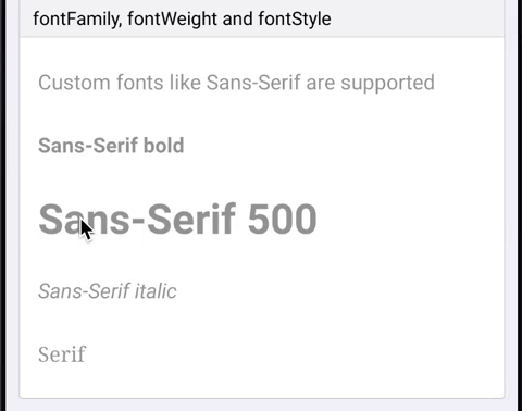 After: 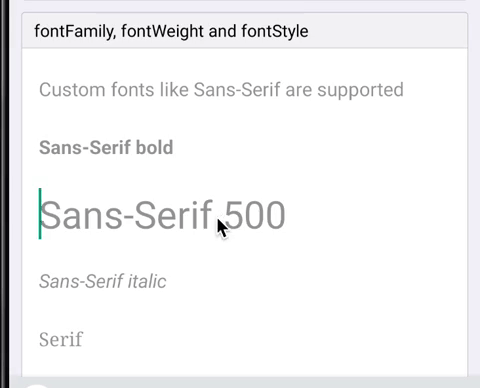 Reviewed By: mmmulani Differential Revision: D17468825 Pulled By: JoshuaGross fbshipit-source-id: bc2219facb94668551a06a68b0ee4690e5474d40
1186 lines
30 KiB
JavaScript
1186 lines
30 KiB
JavaScript
/**
|
|
* Copyright (c) Facebook, Inc. and its affiliates.
|
|
*
|
|
* This source code is licensed under the MIT license found in the
|
|
* LICENSE file in the root directory of this source tree.
|
|
*
|
|
* @format
|
|
* @flow
|
|
*/
|
|
|
|
'use strict';
|
|
|
|
const React = require('react');
|
|
|
|
const {
|
|
Button,
|
|
InputAccessoryView,
|
|
Text,
|
|
TextInput,
|
|
View,
|
|
StyleSheet,
|
|
Slider,
|
|
Switch,
|
|
Alert,
|
|
} = require('react-native');
|
|
|
|
class WithLabel extends React.Component<$FlowFixMeProps> {
|
|
render() {
|
|
return (
|
|
<View style={styles.labelContainer}>
|
|
<View style={styles.label}>
|
|
<Text>{this.props.label}</Text>
|
|
</View>
|
|
{this.props.children}
|
|
</View>
|
|
);
|
|
}
|
|
}
|
|
|
|
class TextEventsExample extends React.Component<{}, $FlowFixMeState> {
|
|
state = {
|
|
curText: '<No Event>',
|
|
prevText: '<No Event>',
|
|
prev2Text: '<No Event>',
|
|
prev3Text: '<No Event>',
|
|
};
|
|
|
|
updateText = text => {
|
|
this.setState(state => {
|
|
return {
|
|
curText: text,
|
|
prevText: state.curText,
|
|
prev2Text: state.prevText,
|
|
prev3Text: state.prev2Text,
|
|
};
|
|
});
|
|
};
|
|
|
|
render() {
|
|
return (
|
|
<View>
|
|
<TextInput
|
|
autoCapitalize="none"
|
|
placeholder="Enter text to see events"
|
|
autoCorrect={false}
|
|
onFocus={() => this.updateText('onFocus')}
|
|
onBlur={() => this.updateText('onBlur')}
|
|
onChange={event =>
|
|
this.updateText('onChange text: ' + event.nativeEvent.text)
|
|
}
|
|
onEndEditing={event =>
|
|
this.updateText('onEndEditing text: ' + event.nativeEvent.text)
|
|
}
|
|
onSubmitEditing={event =>
|
|
this.updateText('onSubmitEditing text: ' + event.nativeEvent.text)
|
|
}
|
|
onSelectionChange={event =>
|
|
this.updateText(
|
|
'onSelectionChange range: ' +
|
|
event.nativeEvent.selection.start +
|
|
',' +
|
|
(event.nativeEvent.selection.end || ''),
|
|
)
|
|
}
|
|
onKeyPress={event => {
|
|
this.updateText('onKeyPress key: ' + event.nativeEvent.key);
|
|
}}
|
|
style={styles.default}
|
|
/>
|
|
<Text style={styles.eventLabel}>
|
|
{this.state.curText}
|
|
{'\n'}
|
|
(prev: {this.state.prevText}){'\n'}
|
|
(prev2: {this.state.prev2Text}){'\n'}
|
|
(prev3: {this.state.prev3Text})
|
|
</Text>
|
|
</View>
|
|
);
|
|
}
|
|
}
|
|
|
|
class TextInputAccessoryViewExample extends React.Component<{}, *> {
|
|
constructor(props) {
|
|
super(props);
|
|
this.state = {text: 'Placeholder Text'};
|
|
}
|
|
|
|
render() {
|
|
const inputAccessoryViewID = 'inputAccessoryView1';
|
|
return (
|
|
<View>
|
|
<TextInput
|
|
style={styles.default}
|
|
inputAccessoryViewID={inputAccessoryViewID}
|
|
onChangeText={text => this.setState({text})}
|
|
value={this.state.text}
|
|
/>
|
|
<InputAccessoryView nativeID={inputAccessoryViewID}>
|
|
<View style={{backgroundColor: 'white'}}>
|
|
<Button
|
|
onPress={() => this.setState({text: 'Placeholder Text'})}
|
|
title="Reset Text"
|
|
/>
|
|
</View>
|
|
</InputAccessoryView>
|
|
</View>
|
|
);
|
|
}
|
|
}
|
|
|
|
class RewriteExample extends React.Component<$FlowFixMeProps, any> {
|
|
constructor(props) {
|
|
super(props);
|
|
this.state = {text: ''};
|
|
}
|
|
render() {
|
|
const limit = 20;
|
|
const remainder = limit - this.state.text.length;
|
|
const remainderColor = remainder > 5 ? 'blue' : 'red';
|
|
return (
|
|
<View style={styles.rewriteContainer}>
|
|
<TextInput
|
|
multiline={false}
|
|
maxLength={limit}
|
|
onChangeText={text => {
|
|
text = text.replace(/ /g, '_');
|
|
this.setState({text});
|
|
}}
|
|
style={styles.default}
|
|
value={this.state.text}
|
|
/>
|
|
<Text style={[styles.remainder, {color: remainderColor}]}>
|
|
{remainder}
|
|
</Text>
|
|
</View>
|
|
);
|
|
}
|
|
}
|
|
|
|
class RewriteExampleInvalidCharacters extends React.Component<
|
|
$FlowFixMeProps,
|
|
any,
|
|
> {
|
|
constructor(props) {
|
|
super(props);
|
|
this.state = {text: ''};
|
|
}
|
|
render() {
|
|
return (
|
|
<View style={styles.rewriteContainer}>
|
|
<TextInput
|
|
multiline={false}
|
|
onChangeText={text => {
|
|
this.setState({text: text.replace(/\s/g, '')});
|
|
}}
|
|
style={styles.default}
|
|
value={this.state.text}
|
|
/>
|
|
</View>
|
|
);
|
|
}
|
|
}
|
|
|
|
class RewriteExampleKana extends React.Component<$FlowFixMeProps, any> {
|
|
constructor(props) {
|
|
super(props);
|
|
this.state = {text: ''};
|
|
}
|
|
render() {
|
|
return (
|
|
<View style={styles.rewriteContainer}>
|
|
<TextInput
|
|
multiline={false}
|
|
onChangeText={text => {
|
|
this.setState({text: text.replace(/ひ/g, '日')});
|
|
}}
|
|
style={styles.default}
|
|
value={this.state.text}
|
|
/>
|
|
</View>
|
|
);
|
|
}
|
|
}
|
|
|
|
class SecureEntryExample extends React.Component<$FlowFixMeProps, any> {
|
|
constructor(props) {
|
|
super(props);
|
|
this.state = {
|
|
text: '',
|
|
password: '',
|
|
isSecureTextEntry: true,
|
|
};
|
|
}
|
|
render() {
|
|
return (
|
|
<View>
|
|
<TextInput
|
|
secureTextEntry={true}
|
|
style={styles.default}
|
|
defaultValue="abc"
|
|
onChangeText={text => this.setState({text})}
|
|
value={this.state.text}
|
|
/>
|
|
<Text>Current text is: {this.state.text}</Text>
|
|
<View
|
|
style={{
|
|
flex: 1,
|
|
flexDirection: 'row',
|
|
}}>
|
|
<TextInput
|
|
style={styles.default}
|
|
defaultValue="cde"
|
|
onChangeText={text => this.setState({password: text})}
|
|
secureTextEntry={this.state.isSecureTextEntry}
|
|
value={this.state.password}
|
|
/>
|
|
<Switch
|
|
onValueChange={value => {
|
|
this.setState({isSecureTextEntry: value});
|
|
}}
|
|
style={{marginLeft: 4}}
|
|
value={this.state.isSecureTextEntry}
|
|
/>
|
|
</View>
|
|
</View>
|
|
);
|
|
}
|
|
}
|
|
|
|
class TokenizedTextExample extends React.Component<$FlowFixMeProps, any> {
|
|
constructor(props) {
|
|
super(props);
|
|
this.state = {text: 'Hello #World'};
|
|
}
|
|
render() {
|
|
//define delimiter
|
|
let delimiter = /\s+/;
|
|
|
|
//split string
|
|
let _text = this.state.text;
|
|
let token,
|
|
index,
|
|
parts = [];
|
|
while (_text) {
|
|
delimiter.lastIndex = 0;
|
|
token = delimiter.exec(_text);
|
|
if (token === null) {
|
|
break;
|
|
}
|
|
index = token.index;
|
|
if (token[0].length === 0) {
|
|
index = 1;
|
|
}
|
|
parts.push(_text.substr(0, index));
|
|
parts.push(token[0]);
|
|
index = index + token[0].length;
|
|
_text = _text.slice(index);
|
|
}
|
|
parts.push(_text);
|
|
|
|
//highlight hashtags
|
|
parts = parts.map(text => {
|
|
if (/^#/.test(text)) {
|
|
return (
|
|
<Text key={text} style={styles.hashtag}>
|
|
{text}
|
|
</Text>
|
|
);
|
|
} else {
|
|
return text;
|
|
}
|
|
});
|
|
|
|
return (
|
|
<View>
|
|
<TextInput
|
|
multiline={true}
|
|
style={styles.multiline}
|
|
onChangeText={text => {
|
|
this.setState({text});
|
|
}}>
|
|
<Text>{parts}</Text>
|
|
</TextInput>
|
|
</View>
|
|
);
|
|
}
|
|
}
|
|
|
|
class BlurOnSubmitExample extends React.Component<{}> {
|
|
focusNextField = nextField => {
|
|
this.refs[nextField].focus();
|
|
};
|
|
|
|
render() {
|
|
return (
|
|
<View>
|
|
<TextInput
|
|
ref="1"
|
|
style={styles.default}
|
|
placeholder="blurOnSubmit = false"
|
|
returnKeyType="next"
|
|
blurOnSubmit={false}
|
|
onSubmitEditing={() => this.focusNextField('2')}
|
|
/>
|
|
<TextInput
|
|
ref="2"
|
|
style={styles.default}
|
|
keyboardType="email-address"
|
|
placeholder="blurOnSubmit = false"
|
|
returnKeyType="next"
|
|
blurOnSubmit={false}
|
|
onSubmitEditing={() => this.focusNextField('3')}
|
|
/>
|
|
<TextInput
|
|
ref="3"
|
|
style={styles.default}
|
|
keyboardType="url"
|
|
placeholder="blurOnSubmit = false"
|
|
returnKeyType="next"
|
|
blurOnSubmit={false}
|
|
onSubmitEditing={() => this.focusNextField('4')}
|
|
/>
|
|
<TextInput
|
|
ref="4"
|
|
style={styles.default}
|
|
keyboardType="numeric"
|
|
returnKeyType="done"
|
|
placeholder="blurOnSubmit = false"
|
|
blurOnSubmit={false}
|
|
onSubmitEditing={() => this.focusNextField('5')}
|
|
/>
|
|
<TextInput
|
|
ref="5"
|
|
style={styles.default}
|
|
keyboardType="numbers-and-punctuation"
|
|
placeholder="blurOnSubmit = true"
|
|
returnKeyType="done"
|
|
/>
|
|
</View>
|
|
);
|
|
}
|
|
}
|
|
|
|
type SelectionExampleState = {
|
|
selection: $ReadOnly<{|
|
|
start: number,
|
|
end?: number,
|
|
|}>,
|
|
value: string,
|
|
};
|
|
|
|
class SelectionExample extends React.Component<
|
|
$FlowFixMeProps,
|
|
SelectionExampleState,
|
|
> {
|
|
_textInput: any;
|
|
|
|
constructor(props) {
|
|
super(props);
|
|
this.state = {
|
|
selection: {start: 0, end: 0},
|
|
value: props.value,
|
|
};
|
|
}
|
|
|
|
onSelectionChange({nativeEvent: {selection}}) {
|
|
this.setState({selection});
|
|
}
|
|
|
|
getRandomPosition() {
|
|
const length = this.state.value.length;
|
|
return Math.round(Math.random() * length);
|
|
}
|
|
|
|
select(start, end) {
|
|
this._textInput.focus();
|
|
this.setState({selection: {start, end}});
|
|
}
|
|
|
|
selectRandom() {
|
|
const positions = [this.getRandomPosition(), this.getRandomPosition()].sort(
|
|
(a, b) => a - b,
|
|
);
|
|
this.select(...positions);
|
|
}
|
|
|
|
placeAt(position) {
|
|
this.select(position, position);
|
|
}
|
|
|
|
placeAtRandom() {
|
|
this.placeAt(this.getRandomPosition());
|
|
}
|
|
|
|
render() {
|
|
const length = this.state.value.length;
|
|
|
|
return (
|
|
<View>
|
|
<TextInput
|
|
multiline={this.props.multiline}
|
|
onChangeText={value => this.setState({value})}
|
|
onSelectionChange={this.onSelectionChange.bind(this)}
|
|
ref={textInput => (this._textInput = textInput)}
|
|
selection={this.state.selection}
|
|
style={this.props.style}
|
|
value={this.state.value}
|
|
/>
|
|
<View>
|
|
<Text>selection = {JSON.stringify(this.state.selection)}</Text>
|
|
<Text onPress={this.placeAt.bind(this, 0)}>
|
|
Place at Start (0, 0)
|
|
</Text>
|
|
<Text onPress={this.placeAt.bind(this, length)}>
|
|
Place at End ({length}, {length})
|
|
</Text>
|
|
<Text onPress={this.placeAtRandom.bind(this)}>Place at Random</Text>
|
|
<Text onPress={this.select.bind(this, 0, length)}>Select All</Text>
|
|
<Text onPress={this.selectRandom.bind(this)}>Select Random</Text>
|
|
</View>
|
|
</View>
|
|
);
|
|
}
|
|
}
|
|
|
|
class AutogrowingTextInputExample extends React.Component<
|
|
$FlowFixMeProps,
|
|
$FlowFixMeState,
|
|
> {
|
|
constructor(props) {
|
|
super(props);
|
|
|
|
this.state = {
|
|
width: 100,
|
|
multiline: true,
|
|
text: '',
|
|
contentSize: {
|
|
width: 0,
|
|
height: 0,
|
|
},
|
|
};
|
|
}
|
|
|
|
UNSAFE_componentWillReceiveProps(props) {
|
|
this.setState({
|
|
multiline: props.multiline,
|
|
});
|
|
}
|
|
|
|
render() {
|
|
const {style, multiline, ...props} = this.props;
|
|
return (
|
|
<View>
|
|
<Text>Width:</Text>
|
|
<Slider
|
|
value={100}
|
|
minimumValue={0}
|
|
maximumValue={100}
|
|
step={10}
|
|
onValueChange={value => this.setState({width: value})}
|
|
/>
|
|
<Text>Multiline:</Text>
|
|
<Switch
|
|
value={this.state.multiline}
|
|
onValueChange={value => this.setState({multiline: value})}
|
|
/>
|
|
<Text>TextInput:</Text>
|
|
<TextInput
|
|
value="prop"
|
|
multiline={this.state.multiline}
|
|
style={[style, {width: this.state.width + '%'}]}
|
|
onChangeText={value => this.setState({text: value})}
|
|
onContentSizeChange={event =>
|
|
this.setState({contentSize: event.nativeEvent.contentSize})
|
|
}
|
|
{...props}
|
|
/>
|
|
<Text>Plain text value representation:</Text>
|
|
<Text>{this.state.text}</Text>
|
|
<Text>Content Size: {JSON.stringify(this.state.contentSize)}</Text>
|
|
</View>
|
|
);
|
|
}
|
|
}
|
|
|
|
const styles = StyleSheet.create({
|
|
default: {
|
|
borderWidth: StyleSheet.hairlineWidth,
|
|
borderColor: '#0f0f0f',
|
|
flex: 1,
|
|
fontSize: 13,
|
|
padding: 4,
|
|
},
|
|
multiline: {
|
|
borderWidth: StyleSheet.hairlineWidth,
|
|
borderColor: '#0f0f0f',
|
|
flex: 1,
|
|
fontSize: 13,
|
|
height: 50,
|
|
padding: 4,
|
|
marginBottom: 4,
|
|
},
|
|
multilinePlaceholderStyles: {
|
|
letterSpacing: 10,
|
|
lineHeight: 20,
|
|
textAlign: 'center',
|
|
},
|
|
multilineExpandable: {
|
|
height: 'auto',
|
|
maxHeight: 100,
|
|
},
|
|
multilineWithFontStyles: {
|
|
color: 'blue',
|
|
fontWeight: 'bold',
|
|
fontSize: 18,
|
|
fontFamily: 'Cochin',
|
|
height: 60,
|
|
},
|
|
singlelinePlaceholderStyles: {
|
|
letterSpacing: 10,
|
|
textAlign: 'center',
|
|
},
|
|
eventLabel: {
|
|
margin: 3,
|
|
fontSize: 12,
|
|
},
|
|
labelContainer: {
|
|
flexDirection: 'row',
|
|
marginVertical: 2,
|
|
flex: 1,
|
|
},
|
|
label: {
|
|
width: 115,
|
|
alignItems: 'flex-end',
|
|
marginRight: 10,
|
|
paddingTop: 2,
|
|
},
|
|
rewriteContainer: {
|
|
flexDirection: 'row',
|
|
alignItems: 'center',
|
|
},
|
|
remainder: {
|
|
textAlign: 'right',
|
|
width: 24,
|
|
},
|
|
hashtag: {
|
|
color: 'blue',
|
|
fontWeight: 'bold',
|
|
},
|
|
});
|
|
|
|
exports.displayName = (undefined: ?string);
|
|
exports.title = '<TextInput>';
|
|
exports.description = 'Single and multi-line text inputs.';
|
|
exports.examples = [
|
|
{
|
|
title: 'Auto-focus',
|
|
render: function(): React.Node {
|
|
return (
|
|
<TextInput
|
|
autoFocus={true}
|
|
style={styles.default}
|
|
accessibilityLabel="I am the accessibility label for text input"
|
|
/>
|
|
);
|
|
},
|
|
},
|
|
{
|
|
title: "Live Re-Write (<sp> -> '_') + maxLength",
|
|
render: function(): React.Node {
|
|
return <RewriteExample />;
|
|
},
|
|
},
|
|
{
|
|
title: 'Live Re-Write (no spaces allowed)',
|
|
render: function(): React.Node {
|
|
return <RewriteExampleInvalidCharacters />;
|
|
},
|
|
},
|
|
{
|
|
title: 'Live Re-Write (ひ -> 日)',
|
|
render: function(): React.Node {
|
|
return <RewriteExampleKana />;
|
|
},
|
|
},
|
|
{
|
|
title: 'Keyboard Accessory View',
|
|
render: function(): React.Node {
|
|
return <TextInputAccessoryViewExample />;
|
|
},
|
|
},
|
|
{
|
|
title: 'Auto-capitalize',
|
|
render: function(): React.Node {
|
|
return (
|
|
<View>
|
|
<WithLabel label="none">
|
|
<TextInput autoCapitalize="none" style={styles.default} />
|
|
</WithLabel>
|
|
<WithLabel label="sentences">
|
|
<TextInput autoCapitalize="sentences" style={styles.default} />
|
|
</WithLabel>
|
|
<WithLabel label="words">
|
|
<TextInput autoCapitalize="words" style={styles.default} />
|
|
</WithLabel>
|
|
<WithLabel label="characters">
|
|
<TextInput autoCapitalize="characters" style={styles.default} />
|
|
</WithLabel>
|
|
</View>
|
|
);
|
|
},
|
|
},
|
|
{
|
|
title: 'Auto-correct',
|
|
render: function(): React.Node {
|
|
return (
|
|
<View>
|
|
<WithLabel label="true">
|
|
<TextInput autoCorrect={true} style={styles.default} />
|
|
</WithLabel>
|
|
<WithLabel label="false">
|
|
<TextInput autoCorrect={false} style={styles.default} />
|
|
</WithLabel>
|
|
</View>
|
|
);
|
|
},
|
|
},
|
|
{
|
|
title: 'Nested content and `value` property',
|
|
render: function(): React.Node {
|
|
return (
|
|
<View>
|
|
<WithLabel label="singleline">
|
|
<TextInput style={styles.default} value="(value property)">
|
|
(first raw text node)
|
|
<Text style={{color: 'red'}}>(internal raw text node)</Text>
|
|
(last raw text node)
|
|
</TextInput>
|
|
</WithLabel>
|
|
<WithLabel label="multiline">
|
|
<TextInput
|
|
style={styles.default}
|
|
multiline={true}
|
|
value="(value property)">
|
|
(first raw text node)
|
|
<Text style={{color: 'red'}}>(internal raw text node)</Text>
|
|
(last raw text node)
|
|
</TextInput>
|
|
</WithLabel>
|
|
</View>
|
|
);
|
|
},
|
|
},
|
|
{
|
|
title: 'Keyboard types',
|
|
render: function(): React.Node {
|
|
const keyboardTypes = [
|
|
'default',
|
|
'ascii-capable',
|
|
'numbers-and-punctuation',
|
|
'url',
|
|
'number-pad',
|
|
'phone-pad',
|
|
'name-phone-pad',
|
|
'email-address',
|
|
'decimal-pad',
|
|
'twitter',
|
|
'web-search',
|
|
'numeric',
|
|
];
|
|
const examples = keyboardTypes.map(type => {
|
|
return (
|
|
<WithLabel key={type} label={type}>
|
|
<TextInput keyboardType={type} style={styles.default} />
|
|
</WithLabel>
|
|
);
|
|
});
|
|
return <View>{examples}</View>;
|
|
},
|
|
},
|
|
{
|
|
title: 'Keyboard appearance',
|
|
render: function(): React.Node {
|
|
const keyboardAppearance = ['default', 'light', 'dark'];
|
|
const examples = keyboardAppearance.map(type => {
|
|
return (
|
|
<WithLabel key={type} label={type}>
|
|
<TextInput keyboardAppearance={type} style={styles.default} />
|
|
</WithLabel>
|
|
);
|
|
});
|
|
return <View>{examples}</View>;
|
|
},
|
|
},
|
|
{
|
|
title: 'Return key types',
|
|
render: function(): React.Node {
|
|
const returnKeyTypes = [
|
|
'default',
|
|
'go',
|
|
'google',
|
|
'join',
|
|
'next',
|
|
'route',
|
|
'search',
|
|
'send',
|
|
'yahoo',
|
|
'done',
|
|
'emergency-call',
|
|
];
|
|
const examples = returnKeyTypes.map(type => {
|
|
return (
|
|
<WithLabel key={type} label={type}>
|
|
<TextInput returnKeyType={type} style={styles.default} />
|
|
</WithLabel>
|
|
);
|
|
});
|
|
return <View>{examples}</View>;
|
|
},
|
|
},
|
|
{
|
|
title: 'Enable return key automatically',
|
|
render: function(): React.Node {
|
|
return (
|
|
<View>
|
|
<WithLabel label="true">
|
|
<TextInput
|
|
enablesReturnKeyAutomatically={true}
|
|
style={styles.default}
|
|
/>
|
|
</WithLabel>
|
|
</View>
|
|
);
|
|
},
|
|
},
|
|
{
|
|
title: 'Secure text entry',
|
|
render: function(): React.Node {
|
|
return <SecureEntryExample />;
|
|
},
|
|
},
|
|
{
|
|
title: 'Event handling',
|
|
render: function(): React.Element<any> {
|
|
return <TextEventsExample />;
|
|
},
|
|
},
|
|
{
|
|
title: 'Colored input text',
|
|
render: function(): React.Node {
|
|
return (
|
|
<View>
|
|
<TextInput
|
|
style={[styles.default, {color: 'blue'}]}
|
|
defaultValue="Blue"
|
|
/>
|
|
<TextInput
|
|
style={[styles.default, {color: 'green'}]}
|
|
defaultValue="Green"
|
|
/>
|
|
</View>
|
|
);
|
|
},
|
|
},
|
|
{
|
|
title: 'Colored highlight/cursor for text input',
|
|
render: function(): React.Node {
|
|
return (
|
|
<View>
|
|
<TextInput
|
|
style={styles.default}
|
|
selectionColor={'green'}
|
|
defaultValue="Highlight me"
|
|
/>
|
|
<TextInput
|
|
style={styles.default}
|
|
selectionColor={'rgba(86, 76, 205, 1)'}
|
|
defaultValue="Highlight me"
|
|
/>
|
|
</View>
|
|
);
|
|
},
|
|
},
|
|
{
|
|
title: 'Clear button mode',
|
|
render: function(): React.Node {
|
|
const clearButtonModes = [
|
|
'never',
|
|
'while-editing',
|
|
'unless-editing',
|
|
'always',
|
|
];
|
|
const examples = clearButtonModes.map(mode => {
|
|
return (
|
|
<WithLabel key={mode} label={mode}>
|
|
<TextInput
|
|
style={styles.default}
|
|
clearButtonMode={mode}
|
|
defaultValue={mode}
|
|
/>
|
|
</WithLabel>
|
|
);
|
|
});
|
|
return <View>{examples}</View>;
|
|
},
|
|
},
|
|
{
|
|
title: 'Clear and select',
|
|
render: function(): React.Node {
|
|
return (
|
|
<View>
|
|
<WithLabel label="clearTextOnFocus">
|
|
<TextInput
|
|
placeholder="text is cleared on focus"
|
|
defaultValue="text is cleared on focus"
|
|
style={styles.default}
|
|
clearTextOnFocus={true}
|
|
/>
|
|
</WithLabel>
|
|
<WithLabel label="selectTextOnFocus">
|
|
<TextInput
|
|
placeholder="text is selected on focus"
|
|
defaultValue="text is selected on focus"
|
|
style={styles.default}
|
|
selectTextOnFocus={true}
|
|
/>
|
|
</WithLabel>
|
|
<WithLabel label="clearTextOnFocus (multiline)">
|
|
<TextInput
|
|
placeholder="text is cleared on focus"
|
|
defaultValue="text is cleared on focus"
|
|
style={styles.default}
|
|
clearTextOnFocus={true}
|
|
multiline={true}
|
|
/>
|
|
</WithLabel>
|
|
<WithLabel label="selectTextOnFocus (multiline)">
|
|
<TextInput
|
|
placeholder="text is selected on focus"
|
|
defaultValue="text is selected on focus"
|
|
style={styles.default}
|
|
selectTextOnFocus={true}
|
|
multiline={true}
|
|
/>
|
|
</WithLabel>
|
|
</View>
|
|
);
|
|
},
|
|
},
|
|
{
|
|
title: 'Blur on submit',
|
|
render: function(): React.Element<any> {
|
|
return <BlurOnSubmitExample />;
|
|
},
|
|
},
|
|
{
|
|
title: 'Multiline blur on submit',
|
|
render: function(): React.Node {
|
|
return (
|
|
<View>
|
|
<TextInput
|
|
style={styles.multiline}
|
|
placeholder="blurOnSubmit = true"
|
|
returnKeyType="next"
|
|
blurOnSubmit={true}
|
|
multiline={true}
|
|
onSubmitEditing={event =>
|
|
Alert.alert('Alert', event.nativeEvent.text)
|
|
}
|
|
/>
|
|
</View>
|
|
);
|
|
},
|
|
},
|
|
{
|
|
title: 'Multiline',
|
|
render: function(): React.Node {
|
|
return (
|
|
<View>
|
|
<TextInput
|
|
placeholder="multiline text input"
|
|
multiline={true}
|
|
style={styles.multiline}
|
|
/>
|
|
<TextInput
|
|
placeholder="multiline text input with font styles and placeholder"
|
|
multiline={true}
|
|
clearTextOnFocus={true}
|
|
autoCorrect={true}
|
|
autoCapitalize="words"
|
|
placeholderTextColor="red"
|
|
keyboardType="url"
|
|
style={[styles.multiline, styles.multilineWithFontStyles]}
|
|
/>
|
|
<TextInput
|
|
placeholder="multiline text input with max length"
|
|
maxLength={5}
|
|
multiline={true}
|
|
style={styles.multiline}
|
|
/>
|
|
<TextInput
|
|
placeholder="uneditable multiline text input"
|
|
editable={false}
|
|
multiline={true}
|
|
style={styles.multiline}
|
|
/>
|
|
<TextInput
|
|
defaultValue="uneditable multiline text input with phone number detection: 88888888."
|
|
editable={false}
|
|
multiline={true}
|
|
style={styles.multiline}
|
|
dataDetectorTypes="phoneNumber"
|
|
/>
|
|
</View>
|
|
);
|
|
},
|
|
},
|
|
{
|
|
title: 'TextInput Intrinsic Size',
|
|
render: function(): React.Node {
|
|
return (
|
|
<View>
|
|
<Text>Singleline TextInput</Text>
|
|
<View style={{height: 80}}>
|
|
<TextInput
|
|
style={{
|
|
position: 'absolute',
|
|
fontSize: 16,
|
|
backgroundColor: '#eeeeee',
|
|
borderColor: '#666666',
|
|
borderWidth: 5,
|
|
borderTopWidth: 20,
|
|
borderRadius: 10,
|
|
borderBottomRightRadius: 20,
|
|
padding: 10,
|
|
paddingTop: 20,
|
|
}}
|
|
testID="singleline_textinput"
|
|
placeholder="Placeholder defines intrinsic size"
|
|
/>
|
|
</View>
|
|
<Text>Multiline TextInput</Text>
|
|
<View style={{height: 130}}>
|
|
<TextInput
|
|
style={{
|
|
position: 'absolute',
|
|
fontSize: 16,
|
|
backgroundColor: '#eeeeee',
|
|
borderColor: '#666666',
|
|
borderWidth: 5,
|
|
borderTopWidth: 20,
|
|
borderRadius: 10,
|
|
borderBottomRightRadius: 20,
|
|
padding: 10,
|
|
paddingTop: 20,
|
|
maxHeight: 100,
|
|
}}
|
|
testID="multiline_textinput"
|
|
multiline={true}
|
|
placeholder="Placeholder defines intrinsic size"
|
|
/>
|
|
</View>
|
|
<View>
|
|
<TextInput
|
|
style={{
|
|
fontSize: 16,
|
|
backgroundColor: '#eeeeee',
|
|
borderColor: '#666666',
|
|
borderWidth: 5,
|
|
borderTopWidth: 20,
|
|
borderRadius: 10,
|
|
borderBottomRightRadius: 20,
|
|
padding: 10,
|
|
paddingTop: 20,
|
|
}}
|
|
testID="multiline_textinput_with_flex"
|
|
multiline={true}
|
|
placeholder="Placeholder defines intrinsic size"
|
|
/>
|
|
</View>
|
|
</View>
|
|
);
|
|
},
|
|
},
|
|
{
|
|
title: 'Auto-expanding',
|
|
render: function(): React.Node {
|
|
return (
|
|
<View>
|
|
<TextInput
|
|
placeholder="height increases with content"
|
|
defaultValue="React Native enables you to build world-class application experiences on native platforms using a consistent developer experience based on JavaScript and React. The focus of React Native is on developer efficiency across all the platforms you care about - learn once, write anywhere. Facebook uses React Native in multiple production apps and will continue investing in React Native."
|
|
multiline={true}
|
|
enablesReturnKeyAutomatically={true}
|
|
returnKeyType="go"
|
|
style={[styles.multiline, styles.multilineExpandable]}
|
|
/>
|
|
</View>
|
|
);
|
|
},
|
|
},
|
|
{
|
|
title: 'Auto-expanding',
|
|
render: function(): React.Node {
|
|
return (
|
|
<View>
|
|
<AutogrowingTextInputExample
|
|
enablesReturnKeyAutomatically={true}
|
|
returnKeyType="done"
|
|
multiline={true}
|
|
style={{
|
|
maxHeight: 400,
|
|
minHeight: 20,
|
|
paddingTop: 0,
|
|
backgroundColor: '#eeeeee',
|
|
color: 'blue',
|
|
}}>
|
|
<Text style={{fontSize: 30, color: 'green'}}>huge</Text>
|
|
generic generic generic
|
|
<Text style={{fontSize: 6, color: 'red'}}>
|
|
small small small small small small
|
|
</Text>
|
|
<Text>regular regular</Text>
|
|
<Text style={{fontSize: 30, color: 'green'}}>
|
|
huge huge huge huge huge
|
|
</Text>
|
|
generic generic generic
|
|
</AutogrowingTextInputExample>
|
|
</View>
|
|
);
|
|
},
|
|
},
|
|
{
|
|
title: 'Attributed text',
|
|
render: function(): React.Node {
|
|
return <TokenizedTextExample />;
|
|
},
|
|
},
|
|
{
|
|
title: 'Text selection & cursor placement',
|
|
render: function(): React.Node {
|
|
return (
|
|
<View>
|
|
<SelectionExample
|
|
style={styles.default}
|
|
value="text selection can be changed"
|
|
/>
|
|
<SelectionExample
|
|
multiline
|
|
style={styles.multiline}
|
|
value={'multiline text selection\ncan also be changed'}
|
|
/>
|
|
</View>
|
|
);
|
|
},
|
|
},
|
|
{
|
|
title: 'TextInput maxLength',
|
|
render: function(): React.Node {
|
|
return (
|
|
<View>
|
|
<WithLabel label="maxLength: 5">
|
|
<TextInput maxLength={5} style={styles.default} />
|
|
</WithLabel>
|
|
<WithLabel label="maxLength: 5 with placeholder">
|
|
<TextInput
|
|
maxLength={5}
|
|
placeholder="ZIP code entry"
|
|
style={styles.default}
|
|
/>
|
|
</WithLabel>
|
|
<WithLabel label="maxLength: 5 with default value already set">
|
|
<TextInput
|
|
maxLength={5}
|
|
defaultValue="94025"
|
|
style={styles.default}
|
|
/>
|
|
</WithLabel>
|
|
<WithLabel label="maxLength: 5 with very long default value already set">
|
|
<TextInput
|
|
maxLength={5}
|
|
defaultValue="9402512345"
|
|
style={styles.default}
|
|
/>
|
|
</WithLabel>
|
|
</View>
|
|
);
|
|
},
|
|
},
|
|
{
|
|
title: 'Text Content Type',
|
|
render: function(): React.Node {
|
|
return (
|
|
<View>
|
|
<WithLabel label="emailAddress">
|
|
<TextInput textContentType="emailAddress" style={styles.default} />
|
|
</WithLabel>
|
|
<WithLabel label="name">
|
|
<TextInput textContentType="name" style={styles.default} />
|
|
</WithLabel>
|
|
</View>
|
|
);
|
|
},
|
|
},
|
|
{
|
|
title: 'fontFamily, fontWeight and fontStyle',
|
|
render: function(): React.Node {
|
|
return (
|
|
<View>
|
|
<TextInput
|
|
style={[styles.default, {fontFamily: 'sans-serif'}]}
|
|
placeholder="Custom fonts like Sans-Serif are supported"
|
|
/>
|
|
<TextInput
|
|
style={[
|
|
styles.default,
|
|
{fontFamily: 'sans-serif', fontWeight: 'bold'},
|
|
]}
|
|
placeholder="Sans-Serif bold"
|
|
/>
|
|
<TextInput
|
|
style={[
|
|
styles.default,
|
|
{fontFamily: 'sans-serif', fontWeight: '500'},
|
|
]}
|
|
placeholder="Sans-Serif 500"
|
|
/>
|
|
<TextInput
|
|
style={[
|
|
styles.default,
|
|
{fontFamily: 'sans-serif', fontStyle: 'italic'},
|
|
]}
|
|
placeholder="Sans-Serif italic"
|
|
/>
|
|
<TextInput
|
|
style={[styles.default, {fontFamily: 'serif'}]}
|
|
placeholder="Serif"
|
|
/>
|
|
</View>
|
|
);
|
|
},
|
|
},
|
|
{
|
|
title: 'TextInput Placeholder Styles',
|
|
render: function(): React.Node {
|
|
return (
|
|
<View>
|
|
<WithLabel label="letterSpacing: 10 lineHeight: 20 textAlign: 'center'">
|
|
<TextInput
|
|
placeholder="multiline text input"
|
|
multiline={true}
|
|
style={[styles.multiline, styles.multilinePlaceholderStyles]}
|
|
/>
|
|
</WithLabel>
|
|
<WithLabel label="letterSpacing: 10 textAlign: 'center'">
|
|
<TextInput
|
|
placeholder="singleline"
|
|
style={[styles.default, styles.singlelinePlaceholderStyles]}
|
|
/>
|
|
</WithLabel>
|
|
</View>
|
|
);
|
|
},
|
|
},
|
|
];
|