mirror of
https://github.com/facebook/react-native.git
synced 2025-11-01 09:14:26 +00:00
 Vojtech Novak
bd3868643d
Vojtech Novak
bd3868643d
Summary: Motivation is to support ripple radius just like in TouchableNativeFeedback, plus borderless attribute. See https://github.com/facebook/react-native/pull/28009#issuecomment-589489520 In the current form this means user needs to pass an `android_ripple` prop which is an object of this shape: ``` export type RippleConfig = {| color?: ?ColorValue, borderless?: ?boolean, radius?: ?number, |}; ``` Do we want to add methods that would create such config objects - https://facebook.github.io/react-native/docs/touchablenativefeedback#methods ? ## Changelog [Android] [Added] - support borderless and custom ripple radius on Pressable Pull Request resolved: https://github.com/facebook/react-native/pull/28156 Test Plan: Tested locally in RNTester. I noticed that when some content is rendered after the touchables, the ripple effect is "cut off" by the boundaries of the next view. This is not specific to Pressable, it happens to TouchableNativeFeedback too but I just didn't notice it before in https://github.com/facebook/react-native/pull/28009. As it is an issue of its own, I didn't investigate that. 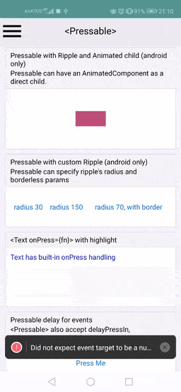 I changed the Touchable example slightly too (I just moved the "custom ripple radius" up to show the "cutting off" issue), so just for completeness: 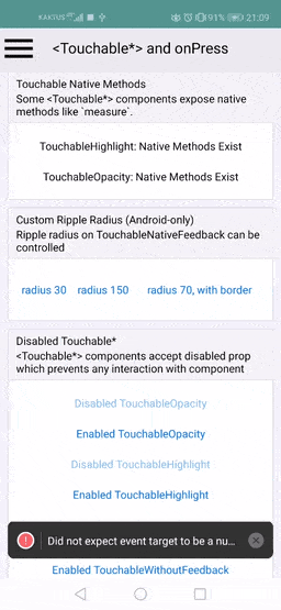 Reviewed By: yungsters Differential Revision: D20071021 Pulled By: TheSavior fbshipit-source-id: cb553030934205a52dd50a2a8c8a20da6100e23f
470 lines
12 KiB
JavaScript
470 lines
12 KiB
JavaScript
/**
|
|
* Copyright (c) Facebook, Inc. and its affiliates.
|
|
*
|
|
* This source code is licensed under the MIT license found in the
|
|
* LICENSE file in the root directory of this source tree.
|
|
*
|
|
* @format
|
|
* @flow strict-local
|
|
*/
|
|
|
|
'use strict';
|
|
|
|
import * as React from 'react';
|
|
import {
|
|
Animated,
|
|
Pressable,
|
|
StyleSheet,
|
|
Text,
|
|
Platform,
|
|
View,
|
|
} from 'react-native';
|
|
|
|
const {useEffect, useRef, useState} = React;
|
|
|
|
const forceTouchAvailable =
|
|
(Platform.OS === 'ios' && Platform.constants.forceTouchAvailable) || false;
|
|
|
|
function ContentPress() {
|
|
const [timesPressed, setTimesPressed] = useState(0);
|
|
|
|
let textLog = '';
|
|
if (timesPressed > 1) {
|
|
textLog = timesPressed + 'x onPress';
|
|
} else if (timesPressed > 0) {
|
|
textLog = 'onPress';
|
|
}
|
|
|
|
return (
|
|
<>
|
|
<View style={styles.row}>
|
|
<Pressable
|
|
onPress={() => {
|
|
setTimesPressed(current => current + 1);
|
|
}}>
|
|
{({pressed}) => (
|
|
<Text style={styles.text}>{pressed ? 'Pressed!' : 'Press Me'}</Text>
|
|
)}
|
|
</Pressable>
|
|
</View>
|
|
<View style={styles.logBox}>
|
|
<Text testID="pressable_press_console">{textLog}</Text>
|
|
</View>
|
|
</>
|
|
);
|
|
}
|
|
|
|
function TextOnPressBox() {
|
|
const [timesPressed, setTimesPressed] = useState(0);
|
|
|
|
let textLog = '';
|
|
if (timesPressed > 1) {
|
|
textLog = timesPressed + 'x text onPress';
|
|
} else if (timesPressed > 0) {
|
|
textLog = 'text onPress';
|
|
}
|
|
|
|
return (
|
|
<>
|
|
<Text
|
|
style={styles.textBlock}
|
|
testID="tappable_text"
|
|
onPress={() => {
|
|
setTimesPressed(prev => prev + 1);
|
|
}}>
|
|
Text has built-in onPress handling
|
|
</Text>
|
|
<View style={styles.logBox}>
|
|
<Text testID="tappable_text_console">{textLog}</Text>
|
|
</View>
|
|
</>
|
|
);
|
|
}
|
|
|
|
function PressableFeedbackEvents() {
|
|
const [eventLog, setEventLog] = useState([]);
|
|
|
|
function appendEvent(eventName) {
|
|
const limit = 6;
|
|
setEventLog(current => {
|
|
return [eventName].concat(current.slice(0, limit - 1));
|
|
});
|
|
}
|
|
|
|
return (
|
|
<View testID="pressable_feedback_events">
|
|
<View style={[styles.row, styles.centered]}>
|
|
<Pressable
|
|
style={styles.wrapper}
|
|
testID="pressable_feedback_events_button"
|
|
accessibilityLabel="pressable feedback events"
|
|
accessibilityRole="button"
|
|
onPress={() => appendEvent('press')}
|
|
onPressIn={() => appendEvent('pressIn')}
|
|
onPressOut={() => appendEvent('pressOut')}
|
|
onLongPress={() => appendEvent('longPress')}>
|
|
<Text style={styles.button}>Press Me</Text>
|
|
</Pressable>
|
|
</View>
|
|
<View
|
|
testID="pressable_feedback_events_console"
|
|
style={styles.eventLogBox}>
|
|
{eventLog.map((e, ii) => (
|
|
<Text key={ii}>{e}</Text>
|
|
))}
|
|
</View>
|
|
</View>
|
|
);
|
|
}
|
|
|
|
function PressableDelayEvents() {
|
|
const [eventLog, setEventLog] = useState([]);
|
|
|
|
function appendEvent(eventName) {
|
|
const limit = 6;
|
|
const newEventLog = eventLog.slice(0, limit - 1);
|
|
newEventLog.unshift(eventName);
|
|
setEventLog(newEventLog);
|
|
}
|
|
|
|
return (
|
|
<View testID="pressable_delay_events">
|
|
<View style={[styles.row, styles.centered]}>
|
|
<Pressable
|
|
style={styles.wrapper}
|
|
testID="pressable_delay_events_button"
|
|
onPress={() => appendEvent('press')}
|
|
onPressIn={() => appendEvent('pressIn')}
|
|
onPressOut={() => appendEvent('pressOut')}
|
|
delayLongPress={800}
|
|
onLongPress={() => appendEvent('longPress - 800ms delay')}>
|
|
<Text style={styles.button}>Press Me</Text>
|
|
</Pressable>
|
|
</View>
|
|
<View style={styles.eventLogBox} testID="pressable_delay_events_console">
|
|
{eventLog.map((e, ii) => (
|
|
<Text key={ii}>{e}</Text>
|
|
))}
|
|
</View>
|
|
</View>
|
|
);
|
|
}
|
|
|
|
function ForceTouchExample() {
|
|
const [force, setForce] = useState(0);
|
|
|
|
const consoleText = forceTouchAvailable
|
|
? 'Force: ' + force.toFixed(3)
|
|
: '3D Touch is not available on this device';
|
|
|
|
return (
|
|
<View testID="pressable_3dtouch_event">
|
|
<View style={styles.forceTouchBox} testID="pressable_3dtouch_output">
|
|
<Text>{consoleText}</Text>
|
|
</View>
|
|
<View style={[styles.row, styles.centered]}>
|
|
<View
|
|
style={styles.wrapper}
|
|
testID="pressable_3dtouch_button"
|
|
onStartShouldSetResponder={() => true}
|
|
onResponderMove={event => setForce(event.nativeEvent.force)}
|
|
onResponderRelease={event => setForce(0)}>
|
|
<Text style={styles.button}>Press Me</Text>
|
|
</View>
|
|
</View>
|
|
</View>
|
|
);
|
|
}
|
|
|
|
function PressableHitSlop() {
|
|
const [timesPressed, setTimesPressed] = useState(0);
|
|
|
|
let log = '';
|
|
if (timesPressed > 1) {
|
|
log = timesPressed + 'x onPress';
|
|
} else if (timesPressed > 0) {
|
|
log = 'onPress';
|
|
}
|
|
|
|
return (
|
|
<View testID="pressable_hit_slop">
|
|
<View style={[styles.row, styles.centered]}>
|
|
<Pressable
|
|
onPress={() => setTimesPressed(num => num + 1)}
|
|
style={styles.hitSlopWrapper}
|
|
hitSlop={{top: 30, bottom: 30, left: 60, right: 60}}
|
|
testID="pressable_hit_slop_button">
|
|
<Text style={styles.hitSlopButton}>Press Outside This View</Text>
|
|
</Pressable>
|
|
</View>
|
|
<View style={styles.logBox}>
|
|
<Text>{log}</Text>
|
|
</View>
|
|
</View>
|
|
);
|
|
}
|
|
|
|
function PressableNativeMethods() {
|
|
const [status, setStatus] = useState<?boolean>(null);
|
|
const ref = useRef(null);
|
|
|
|
useEffect(() => {
|
|
setStatus(ref.current != null && typeof ref.current.measure === 'function');
|
|
}, []);
|
|
|
|
return (
|
|
<>
|
|
<View style={[styles.row, styles.block]}>
|
|
<Pressable ref={ref}>
|
|
<View />
|
|
</Pressable>
|
|
<Text>
|
|
{status == null
|
|
? 'Missing Ref!'
|
|
: status === true
|
|
? 'Native Methods Exist'
|
|
: 'Native Methods Missing!'}
|
|
</Text>
|
|
</View>
|
|
</>
|
|
);
|
|
}
|
|
|
|
function PressableDisabled() {
|
|
return (
|
|
<>
|
|
<Pressable disabled={true} style={[styles.row, styles.block]}>
|
|
<Text style={styles.disabledButton}>Disabled Pressable</Text>
|
|
</Pressable>
|
|
|
|
<Pressable
|
|
disabled={false}
|
|
style={({pressed}) => [
|
|
{opacity: pressed ? 0.5 : 1},
|
|
styles.row,
|
|
styles.block,
|
|
]}>
|
|
<Text style={styles.button}>Enabled Pressable</Text>
|
|
</Pressable>
|
|
</>
|
|
);
|
|
}
|
|
|
|
const styles = StyleSheet.create({
|
|
row: {
|
|
justifyContent: 'center',
|
|
flexDirection: 'row',
|
|
},
|
|
centered: {
|
|
justifyContent: 'center',
|
|
},
|
|
text: {
|
|
fontSize: 16,
|
|
},
|
|
block: {
|
|
padding: 10,
|
|
},
|
|
button: {
|
|
color: '#007AFF',
|
|
},
|
|
disabledButton: {
|
|
color: '#007AFF',
|
|
opacity: 0.5,
|
|
},
|
|
hitSlopButton: {
|
|
color: 'white',
|
|
},
|
|
wrapper: {
|
|
borderRadius: 8,
|
|
},
|
|
wrapperCustom: {
|
|
borderRadius: 8,
|
|
padding: 6,
|
|
},
|
|
hitSlopWrapper: {
|
|
backgroundColor: 'red',
|
|
marginVertical: 30,
|
|
},
|
|
logBox: {
|
|
padding: 20,
|
|
margin: 10,
|
|
borderWidth: StyleSheet.hairlineWidth,
|
|
borderColor: '#f0f0f0',
|
|
backgroundColor: '#f9f9f9',
|
|
},
|
|
eventLogBox: {
|
|
padding: 10,
|
|
margin: 10,
|
|
height: 120,
|
|
borderWidth: StyleSheet.hairlineWidth,
|
|
borderColor: '#f0f0f0',
|
|
backgroundColor: '#f9f9f9',
|
|
},
|
|
forceTouchBox: {
|
|
padding: 10,
|
|
margin: 10,
|
|
borderWidth: StyleSheet.hairlineWidth,
|
|
borderColor: '#f0f0f0',
|
|
backgroundColor: '#f9f9f9',
|
|
alignItems: 'center',
|
|
},
|
|
textBlock: {
|
|
fontWeight: '500',
|
|
color: 'blue',
|
|
},
|
|
});
|
|
|
|
exports.displayName = (undefined: ?string);
|
|
exports.description = 'Component for making views pressable.';
|
|
exports.title = '<Pressable>';
|
|
exports.examples = [
|
|
{
|
|
title: 'Change content based on Press',
|
|
render(): React.Node {
|
|
return <ContentPress />;
|
|
},
|
|
},
|
|
{
|
|
title: 'Change style based on Press',
|
|
render(): React.Node {
|
|
return (
|
|
<View style={styles.row}>
|
|
<Pressable
|
|
style={({pressed}) => [
|
|
{
|
|
backgroundColor: pressed ? 'rgb(210, 230, 255)' : 'white',
|
|
},
|
|
styles.wrapperCustom,
|
|
]}>
|
|
<Text style={styles.text}>Press Me</Text>
|
|
</Pressable>
|
|
</View>
|
|
);
|
|
},
|
|
},
|
|
{
|
|
title: 'Pressable feedback events',
|
|
description: ('<Pressable> components accept onPress, onPressIn, ' +
|
|
'onPressOut, and onLongPress as props.': string),
|
|
render: function(): React.Node {
|
|
return <PressableFeedbackEvents />;
|
|
},
|
|
},
|
|
{
|
|
title: 'Pressable with Ripple and Animated child',
|
|
description: ('Pressable can have an AnimatedComponent as a direct child.': string),
|
|
platform: 'android',
|
|
render: function(): React.Node {
|
|
const mScale = new Animated.Value(1);
|
|
Animated.timing(mScale, {
|
|
toValue: 0.3,
|
|
duration: 1000,
|
|
useNativeDriver: false,
|
|
}).start();
|
|
const style = {
|
|
backgroundColor: 'rgb(180, 64, 119)',
|
|
width: 200,
|
|
height: 100,
|
|
transform: [{scale: mScale}],
|
|
};
|
|
return (
|
|
<View style={styles.row}>
|
|
<Pressable android_ripple={{color: 'green'}}>
|
|
<Animated.View style={style} />
|
|
</Pressable>
|
|
</View>
|
|
);
|
|
},
|
|
},
|
|
{
|
|
title: 'Pressable with custom Ripple',
|
|
description: ("Pressable can specify ripple's radius and borderless params": string),
|
|
platform: 'android',
|
|
render: function(): React.Node {
|
|
const nativeFeedbackButton = {
|
|
textAlign: 'center',
|
|
margin: 10,
|
|
};
|
|
return (
|
|
<View
|
|
style={[
|
|
styles.row,
|
|
{justifyContent: 'space-around', alignItems: 'center'},
|
|
]}>
|
|
<Pressable
|
|
android_ripple={{color: 'orange', borderless: true, radius: 30}}>
|
|
<View>
|
|
<Text style={[styles.button, nativeFeedbackButton]}>
|
|
radius 30
|
|
</Text>
|
|
</View>
|
|
</Pressable>
|
|
|
|
<Pressable android_ripple={{borderless: true, radius: 150}}>
|
|
<View>
|
|
<Text style={[styles.button, nativeFeedbackButton]}>
|
|
radius 150
|
|
</Text>
|
|
</View>
|
|
</Pressable>
|
|
|
|
<Pressable android_ripple={{borderless: false, radius: 70}}>
|
|
<View style={styles.block}>
|
|
<Text style={[styles.button, nativeFeedbackButton]}>
|
|
radius 70, with border
|
|
</Text>
|
|
</View>
|
|
</Pressable>
|
|
</View>
|
|
);
|
|
},
|
|
},
|
|
{
|
|
title: '<Text onPress={fn}> with highlight',
|
|
render: function(): React.Node {
|
|
return <TextOnPressBox />;
|
|
},
|
|
},
|
|
{
|
|
title: 'Pressable delay for events',
|
|
description: ('<Pressable> also accept delayPressIn, ' +
|
|
'delayPressOut, and delayLongPress as props. These props impact the ' +
|
|
'timing of feedback events.': string),
|
|
render: function(): React.Node {
|
|
return <PressableDelayEvents />;
|
|
},
|
|
},
|
|
{
|
|
title: '3D Touch / Force Touch',
|
|
description:
|
|
'iPhone 8 and 8 plus support 3D touch, which adds a force property to touches',
|
|
render: function(): React.Node {
|
|
return <ForceTouchExample />;
|
|
},
|
|
platform: 'ios',
|
|
},
|
|
{
|
|
title: 'Pressable Hit Slop',
|
|
description: ('<Pressable> components accept hitSlop prop which extends the touch area ' +
|
|
'without changing the view bounds.': string),
|
|
render: function(): React.Node {
|
|
return <PressableHitSlop />;
|
|
},
|
|
},
|
|
{
|
|
title: 'Pressable Native Methods',
|
|
description: ('<Pressable> components expose native methods like `measure`.': string),
|
|
render: function(): React.Node {
|
|
return <PressableNativeMethods />;
|
|
},
|
|
},
|
|
{
|
|
title: 'Disabled Pressable',
|
|
description: ('<Pressable> components accept disabled prop which prevents ' +
|
|
'any interaction with component': string),
|
|
render: function(): React.Node {
|
|
return <PressableDisabled />;
|
|
},
|
|
},
|
|
];
|